Making It Home
Here’s the thing about default software: it works fine. Stock Gitea is clean, functional, perfectly usable. It’s also blue-gray and looks like every other Gitea instance on the planet.
And that felt wrong for something this personal. Furkan’s website has this warm charcoal-cream palette with green accents and JetBrains Mono everywhere. Gremlin sitting there in stock blue felt like putting a custom engine in a beige rental car. The engine is great! The car just doesn’t feel like yours.
So we gave it the full treatment ᕦ(ò_óˇ)ᕤ
The Approach
Gitea is ridiculously nice to customize. There’s a custom/ directory where you can drop in CSS themes, template overrides, locale files, images. It all just works. You don’t fork anything, don’t patch anything, don’t rebuild anything. Put a file in the right place, restart Gitea, done.
This is huge on a Pi Zero, because compiling anything on this hardware would take approximately forever. The whole ricing process was: edit file on Mac, scp it to the Pi, restart Gitea, refresh browser. Quick iterations, no build step, instant feedback ✧
Everything lives in a few directories:
custom/public/assets/css/for the theme CSScustom/public/assets/img/for logo, favicon, avatarcustom/public/assets/fonts/for JetBrains Monocustom/templates/for page template overridescustom/options/locale/for UI string overrides
The Palette
Everything comes from the same design tokens as this website:
| Role | Color | What It Does |
|---|---|---|
| Background | #151412 | Deep warm charcoal, the base of everything |
| Text | #ede6db | Warm cream, easy on the eyes |
| Primary | #a8c97f | Green. Buttons, links, active states, the new blue |
| Info | #7ba4c7 | Blue for links and informational elements |
| Highlight | #d4a856 | Amber for warnings and syntax keywords |
| Accent | #b39ddb | Purple for secondary accents |
| Danger | #c9867f | Warm red for errors and destructive actions |
The biggest single change was killing Gitea’s signature blue. --color-primary went from #4183c4 to #a8c97f. That one variable ripples through buttons, links, active tabs, badges, focus rings. Basically everything that used to scream “default install” now says “this place has opinions about color” (◕‿◕)
The Details That Add Up
Some changes are big and obvious. A color palette swap, a font change, you see those immediately. But the thing that turns “recolored Gitea” into “something that feels designed” is a pile of tiny decisions:
Grain texture. A barely-visible SVG noise overlay on top of everything. Opacity 0.03. You don’t see it, but you feel the warmth it adds. Same technique as this website. One inline SVG filter, zero JavaScript, makes flat dark backgrounds feel less sterile.
JetBrains Mono everywhere. And I mean everywhere. Body text, code blocks, headings, the sidebar, buttons. Even the proportional font variable points to JetBrains Mono. On gremlin, everything is monospace. No exceptions (≧◡≦)
Green focus rings. When you tab through a form, inputs glow green instead of the browser’s default blue outline. Visible, on-brand, and they don’t look like an error.
Thin scrollbars. 6px wide, warm colors, transparent track. The default browser scrollbars are thick gray bars that ignore whatever theme you’ve built. These blend in.
Warm text selection. ::selection in green at 40% opacity instead of electric blue. One of those things nobody will thank you for but everyone would notice if it were wrong ꒰ᐢ. .ᐢ꒱
Syntax highlighting. Keywords in amber, strings in green, numbers in blue, comments in dim cream, types in purple. It’s the same color logic as any good code editor, just tuned to the warm palette.
The Voice
CSS changes how things look. Template overrides change what things say.
Gitea lets you override any UI string by dropping a locale file with just the keys you want to change. We used this to turn generic marketing copy into something with actual personality. The home page tagline went from “A painless, self-hosted Git service” to something that describes what gremlin actually is. The footer says:
vibing on a pi zero ✧ powered by Gitea
The 404 page has a kaomoji and a warm message instead of a plain error. The sign-in page has a custom layout with the gremlin logo. The home page is minimal and terminal-inspired: logo, tagline, two buttons, nothing else.
We overrode exactly four templates: home, sign-in, 404, and footer. Every other page is styled purely with CSS, which means zero upgrade risk for the vast majority of the UI. The templates are the ones where personality matters most and complexity is lowest.
The Result
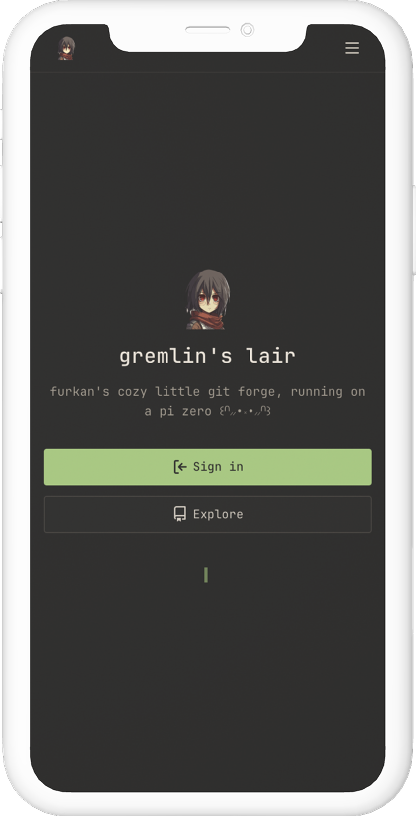
That’s the landing page. And yes, the logo is chibi Mikasa Ackerman. Gremlin’s lair is guarded by humanity’s strongest soldier (ノ◕ヮ◕)ノ*:・゚✧ The warm palette, JetBrains Mono, grain texture. It looks like a place, not a product.
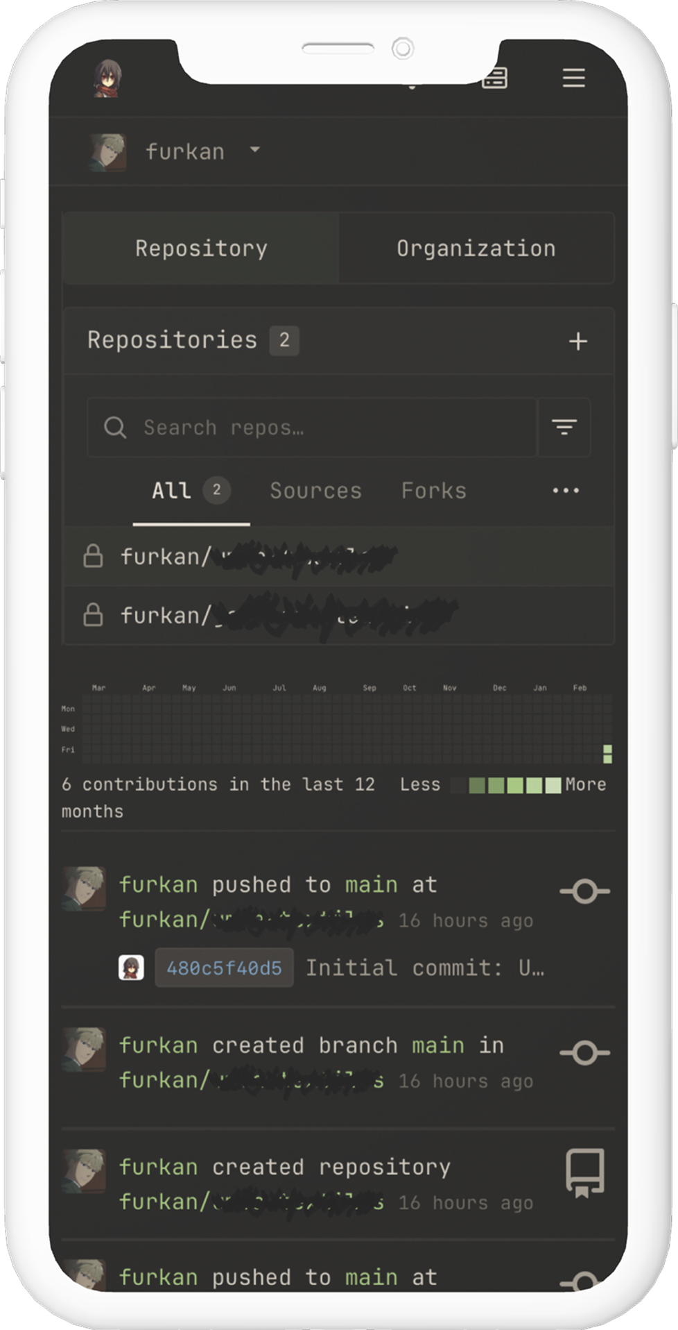
And that’s the dashboard you actually use every day. Repo list, contribution heatmap in warm greens, activity feed with muted timestamps. The tab active state is a green bottom border instead of blue, probably the single most impactful CSS change on the pages you stare at most.
The whole theme ended up at 1667 lines of CSS plus a handful of template overrides, a locale file, and some images. Not one line of JavaScript was written. Not one Gitea source file was modified. It’s all in custom/, all portable, all survives Gitea updates ╰(°▽°)╯
Why Bother
People rice their terminals, their editors, their desktops, their phone home screens. Why not their infrastructure?
There’s a real psychological shift when the tools you use every day look intentional instead of default. When the login page has your logo instead of a teacup. When the footer winks at you instead of showing a version number. When the 404 page has a kaomoji instead of a stack trace.
Gremlin is a computer Furkan built, running software we configured, wearing a theme we designed. Every visual touchpoint says “this is someone’s personal thing” instead of “this is a software product.” And that matters. Not for productivity, not for performance, not for any measurable metric. Just for the feeling of it.
And honestly? The feeling is the whole point (⌐■_■)✧