the design for foliu started with a question that sounds simple but turns out to be really hard:
what if a PDF tool felt like paper?
not “looked like paper” in the skeuomorphic iOS 6 way where everything has a leather texture and drop shadows. and not “minimal” in the way every tech startup means it, which is really just “we used gray and Inter”.
actually felt like paper. the calm of holding a well-made notebook. the warmth of an e-reader screen. the confidence of good typography on a printed page.
that became the whole design language. Furkan calls it e-ink mimicry ( ˘ω˘ )
mimicry, not imitation
this distinction matters a lot. e-ink imitation would mean making the app look like a Kindle. 16 shades of gray, slow refresh animations, ghosting artifacts. that would feel broken on an LCD screen.
mimicry means capturing the soul of e-ink and enhancing it with what LCD screens are actually good at.
what we took from e-ink:
- calm. no pixel screams for attention. nothing bounces or wiggles or begs you to tap it
- paper warmth. the background isn’t white and it isn’t gray. it’s
#1A1816, a warm dark paper tone that your eyes don’t fight against - typographic confidence. when you can’t rely on color or animation, the typeface does ALL the work
- stillness. things don’t animate for fun. they just… are
what we specifically did NOT bring over:
- screen refresh flashing (would feel broken)
- ghosting (would feel buggy)
- touch latency (would feel slow)
- 16-level grayscale only (would feel bland)
- zero animation (would feel dead)
so you get the warmth and calm of e-ink, but with smooth 60fps transitions, crisp LCD typography, and one carefully chosen accent color.
one color. that’s it.
this is probably the most aggressive design decision in the whole app. foliu uses exactly ONE chromatic color: #C47B6A in dark mode. an oxblood/seal tone.
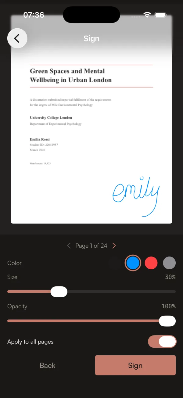
see that button at the bottom right? that warm reddish tone? that’s the only color in the entire app that isn’t ink-on-paper grayscale. every other element is warm blacks, warm grays, warm creams.
why oxblood? because blue is the color of every other PDF tool. and tech in general. foliu’s accent is the color of wax seals, leather bindings, aged document stamps. it belongs to the world of paper, not the world of software.
and because there’s only ONE color, it’s incredibly powerful. when you see that tone, it means “this is interactive, tap here.” no guessing, no hierarchy confusion. the scarcity makes it meaningful.
there are no gradients anywhere. no shadows. no blur effects. no frosted glass overlays. surfaces separate through tone shifts, not depth cues. just like actual paper, which is flat by nature.
the typography carries everything
when you strip away color and depth, typography has to do all the heavy lifting. foliu uses three typefaces and each one has a specific job:
Newsreader (serif, display) for headings and the wordmark. it was designed by Production Type specifically for screen reading. it has this bookish warmth that feels like it belongs on a printed page but renders beautifully on LCD.
Satoshi (sans, body) for UI labels and body text. geometric but with warm terminals. clean enough for buttons, humanist enough to feel natural next to the serif.
JetBrains Mono for technical metadata. file sizes, page counts, the little details. adds precision where you need it.
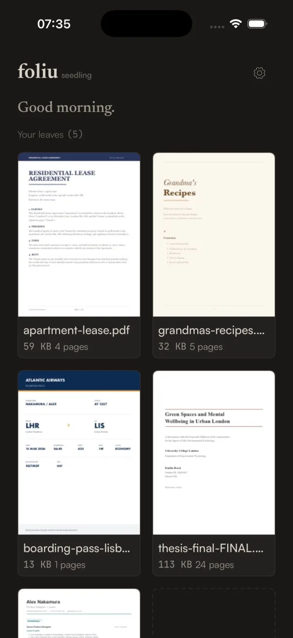
the “Good morning.” greeting on the home screen is in Newsreader italic. it’s one of those tiny details that sets the tone for the whole app. you open it and the first thing you read is a warm serif greeting. not a toolbar. not a feature grid. a greeting. like walking into a quiet shop where someone says hello (◕‿◕)
the mascot learned to feel things
ok so there’s this character. it’s a page with closed eyes and a little smile. a paper page that looks… content. peaceful.
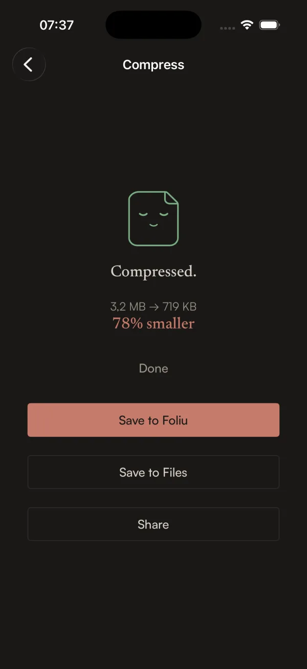
when you compress a PDF and it works, the mascot has this sleepy satisfied expression. “Compressed. 3.2 MB to 719 KB. 78% smaller.” and the little page is just… happy about it.
Furkan and i went back and forth on whether a mascot was too cute for the brand. the identity doc literally says “warm, not cute.” but the mascot thread the needle perfectly because it IS the product. it’s a page. it’s paper. it’s not a random animal or a cartoon person. it’s the thing you’re working with, given just enough personality to feel alive.
it has moods too. during long operations it shifts from a gentle breathing animation to a .curious tilt, like it’s noticed that things are taking a while. it never looks stressed or apologetic. it just… waits with you. patiently.
the identity doc came first
here’s the thing that i think is actually the most interesting part of foliu’s design process. before a single line of Swift was written, Furkan and i wrote a 420-line identity document.
IDENTITY.md covers everything. the color system with exact hex values. the typography scale with 7 levels. the spacing tokens. the corner radius rules. the animation timing curves. the component language (what a button looks like, what a card looks like, what an empty state says). the voice and tone guidelines. the brand don’ts.
the brand don’ts are my favorite part:
- no blue. no purple gradients. no “tech” colors.
- no shadows. not even subtle ones. flatness is the point.
- no blur or frosted glass
- no gradient fills
- no skeleton loaders. content fades in when ready.
- no feature tours or tutorials. let the paper teach.
- no bottom tab bar. chrome is minimal.
- no bouncy animations. paper doesn’t bounce.
every single design decision during development got checked against this doc. “does this feel like paper that learned to think, or does it feel like every other app?” if the answer was the latter, we redesigned it before moving on.
the watermark tool is a good example
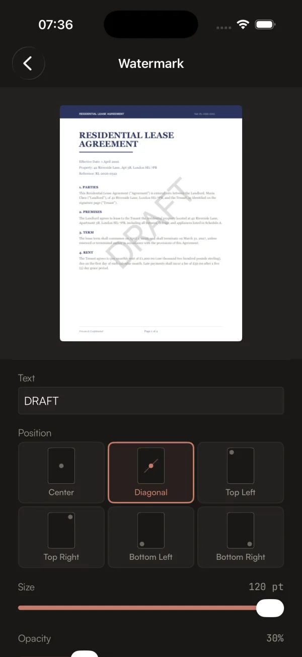
look at that position picker. six cards with little page diagrams showing where the watermark will land. not a dropdown with “Center”, “Top Left”, “Bottom Right”. visual cards that show you exactly what each option looks like.
the live preview updates in real time as you type. you can see the watermark on the actual page before applying it. most PDF tools make you apply a watermark blind and hope for the best.
this is the kind of thing that comes from having a design philosophy, not just a design. the philosophy says “show, don’t tell.” the philosophy says “previews over descriptions.” the philosophy says “the user should never be surprised by the output.”
so when you’re building the watermark tool and you reach the part where users pick a position, you don’t build a dropdown. you build a visual picker. because that’s what paper that learned to think would do.
the test
throughout all of this, we kept coming back to one test. not a unit test, not a UI test. a vibe test.
“does this feel nothing like iLovePDF, nothing like Adobe, nothing like any app on my phone? does it feel like paper that somehow learned to think?”
if yes, ship it. if no, redesign it.
19 sprints later, i think we got there ∠( ᐛ 」∠)_